Museum of Torture
The Torture Museum in Amsterdam is home to some of humanity’s most bizarre and disturbing history. The museum wanted to say goodbye to their predictable medieval visual language and breathe life into the gruesome subject to reach a broader audience.
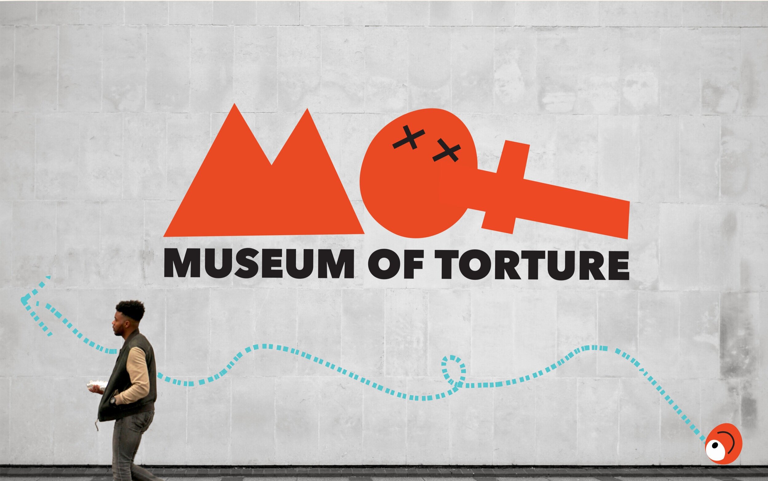
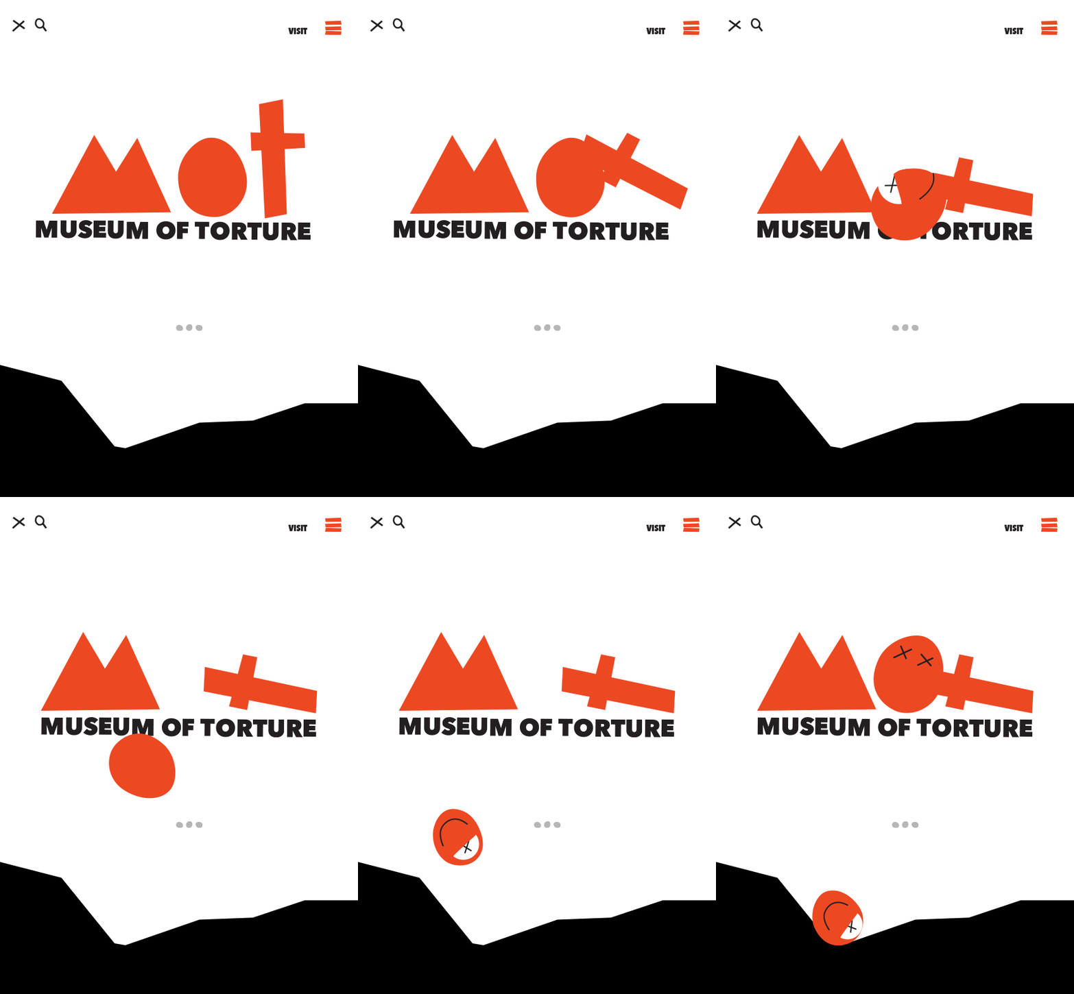
What would make the Dark Ages relatable in the modern world? In researching the extreme punishments of the time for often everyday sins I realized I would have been guilty of a number of these crimes! Something like gossip could land you having your tongue cut out! So I asked the question: Would any of us have stood a chance in a time with such extreme punishment? How would you have faired? Are you guilty? This became the new tone of voice for the museum. For the visual language, the macabre would probably appeal to only a niche group, but something playful, quirky and a little mysterious might capture the curiosity of a broader demographic. I used wonky shapes and lettering to represent the “guilt” (read imperfections) in us all and that unsettling feeling the subject brings. I wanted to stay away from the clichè black and red coloring and rather used a vibrant orange and murky blue paired with animation to keep things playful and make torture a bit of history that we can look back and laugh at, not just walk away feeling queasy.
The full design seen here is all my own and original. I designed everything from branding, illustrations, original font for the logo, to copy, rollout, and responsive web design. I did not take the original photography however I selected the photos and applied my own treatments to them. The Torture Museum is a real museum in Amsterdam and was not involved in this brief.
To the left is the branding of the original Torture Museum. Continue on for my rebrand.


